Pantone Spring 2017: Niagara Inspiration

Pantone Spring 2017 Niagara Inspiration | https://www.roseclearfield.com

When I started featuring the Pantone Spring 2017 colors, it was still January. It can be a little depressing thinking about spring that time of year. But now that it’s almost April, it’s a little more exciting. Right? I know, sometimes the weather is even worse this time of year, but we’re that much closer to nice weather.

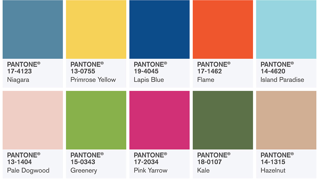
Here are the Pantone spring 2017 selections. You can read more about them over here.

Pantone Spring 2017 Colors | https://www.roseclearfield.com

I think it’s a pretty solid set of colors. Of course, I like some of them more than others, but there’s so much potential here for refreshing spring palettes. I’m periodically highlighting a few of my favorites here on the blog, providing inspiration for home decor, DIY, fashion, and much more.

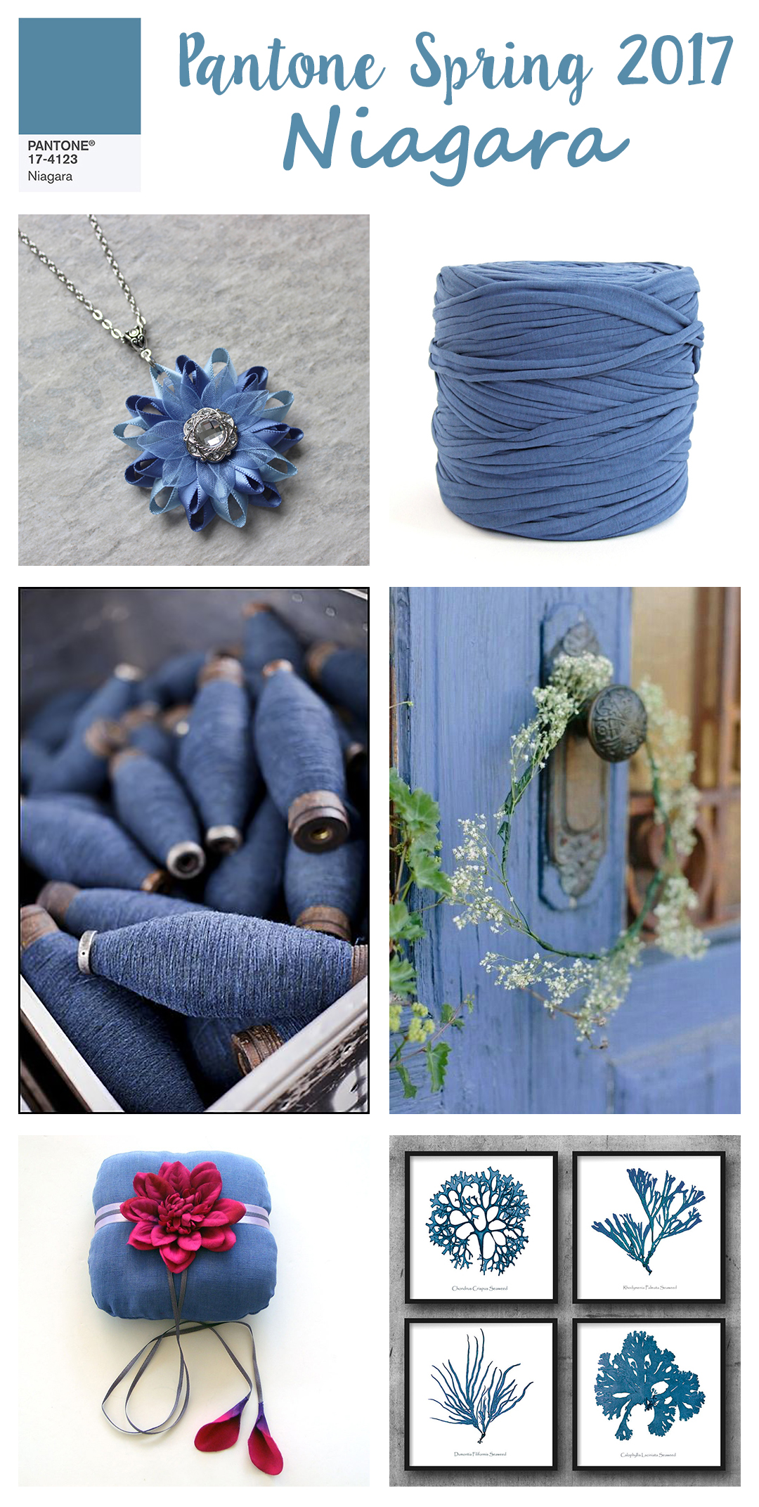
Today I’m highlighting Niagara. Not surprisingly, I LOVE Island Paradise, but Niagara is a great shade, too. It’s not dull, but it’s subtle enough to pass as a neutral. For my Greenery inspiration post, I put together a Greenery shot for Instagram. It’s been so well received I had to create a few more.

Pantone Spring 2017 Niagara Inspiration | https://www.roseclearfield.com

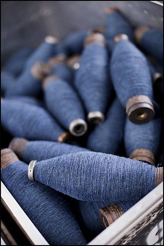
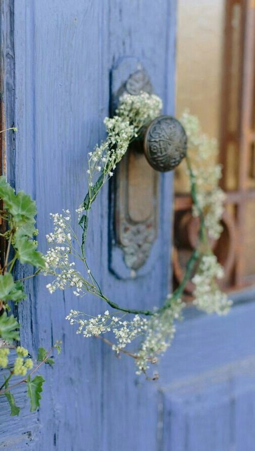
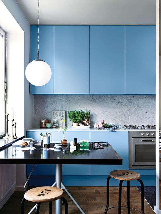
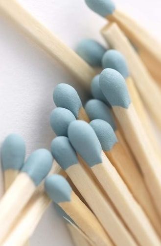
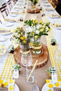
Some Niagara inspiration on Pinterest.
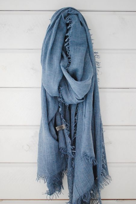
Pantone Spring 2017 Niagara Pinterest Inspiration | https://www.roseclearfield.comPantone Spring 2017 Niagara Pinterest Inspiration | https://www.roseclearfield.comPantone Spring 2017 Niagara Pinterest Inspiration | https://www.roseclearfield.comPantone Spring 2017 Niagara Pinterest Inspiration | https://www.roseclearfield.comPantone Spring 2017 Niagara Pinterest Inspiration | https://www.roseclearfield.comPantone Spring 2017 Niagara Pinterest Inspiration | https://www.roseclearfield.com Pinterest sources: 1 // 2 // 3 // 4 // 5 // 6

*

Of course, I had to find some Niagara picks on Etsy, too!

Pantone Spring 2017 Niagara Etsy Picks | https://www.roseclearfield.com

gemstone round beads // ring bearer pillow
waxed linen cord // chevron fabric
wood beads // necklace
coral prints // t-shirt yarn
earrings // pillow

*

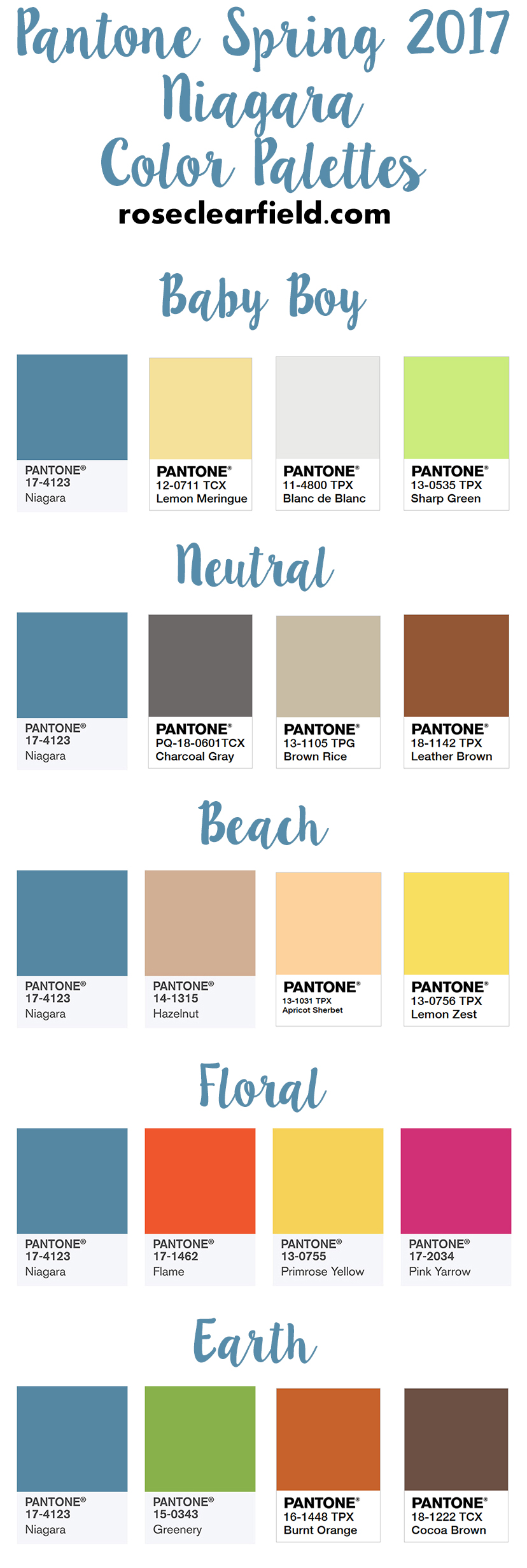
Finally, I’ve put together a few color palettes featuring Niagara.

Pantone Spring 2017 Niagara Color Palettes | https://www.roseclearfield.com

What are your favorite Pantone spring 2017 shades?

Share your input in the comments!


More Pantone inspiration!

2017 Pantone Color of the Year Greenery Inspiration | https://www.roseclearfield.com

2017 Pantone Color of the Year Greenery Inspiration

Pantone Spring 2017 Island Paradise - Tahiti | https://www.roseclearfield.com

Pantone Spring 2017: Island Paradise Inspiration

Pantone Spring 2017 Primrose Yellow - Spring Summer Tablescape | https://www.roseclearfield.com

Pantone Spring 2017: Primrose Yellow Inspiration

Save

Save

Save

Save

Save

Save

Save

4 thoughts on “Pantone Spring 2017: Niagara Inspiration”

  1. It looks like the person who painted my first apartment was ahead of their time – the living room was a startling orange that reminds me of Flame, the bathroom and kitchen were close to Primrose Yellow, and the bedroom was a bright green close to Greenery! People would blink in surprise when they first came in because it was all very bright.

Leave a Comment

Your email address will not be published. Required fields are marked *

This site uses Akismet to reduce spam. Learn how your comment data is processed.